Pages

Showing posts with label finial press. Show all posts

Saturday, May 4, 2013

White Chocolate


I needed to make a wedding card for my niece and I decided to use Karen’s great sketch at the Sweet Sunday Sketch Challenge.

I flipped the sketch and changed a couple of things but it was great!  It gave me lots of inspiration, when I had no idea what to do and I was really happy with how it turned out.


IMG_6202


I’ve actually used lots of retired or soon to be retired stuff on this card.  I still love these hearts from Always and I noticed that one of the Tiny Tags stamps has little dots around the edge which match the dots on the hearts, Yeah!  (But I’m sad the Tiny Tags are retiring).  And the beautiful flowers, I haven’t used them much but they look so pretty, I might save them for any wedding cards I need to make in the future :)

I embossed the Always hearts with white onto vanilla and cut them out minus the dot part.  Then I stamped again and embossed with crumb cake onto shimmery white card, cut them out and put them together.

Ingredients :

Stamps : Always, Tiny Tags

Card : crumb cake, shimmery white, vanilla

Ink : espresso, versamark, crumb cake

Other : clear ep., white ep,, big shot, finial press ef, vanilla seam binding, flower trim, adorning accents edgelit, essentials paper piercing pack, tag punch, linen thread


IMG_6195 


My youngest daughter thought it was a very “yummy-looking card”!  She thought the flowers looked like white chocolate :)


Kathy

Sunday, April 7, 2013

Not Quite Baja


Well I’m having a little break from creating at the moment.

After Still AddINKtive folding, I’m not on any design teams any more and I’m just taking some time out for a bit.

Last year I was extremely honoured to be asked to be on the Splitcoast Stampers Dirty Dozen Design Team.  It was a 6 month term and was exciting and challenging at the same time.  It was a wonderful experience.  Anyway, as I’m having a little break I thought I would start putting my Dirty Dozen cards on my blog.


IMG_4715


Ingredients:

Stamps :  forever young, whimsical words

Card : NQN, baja, white, subtles dsp stack

Ink : stazon, pool party, turquoise, pip, wisteria, crumb cake NQN

Other : big shot, finial press ef, scallop trim border, labels framelits, brayer


This one wasn’t actually made in my first month there, but I chose it to show today because of the colours in it. 

If you haven’t already heard, Stampin Up are changing their colour families.  We are getting a few favourites back like blushing bride and pear pizzazz :),  a few in colours are staying longer like pool party and wisteria wonder :), but some are going like Baja and Not Quite Navy :(  :(  :(  :(

I am so sad about that!  I do love Pool Party, but Baja and Not Quite Navy are my favourite Stampin Up colours of all time!

I’m not sure how I’ll create without them but I’ll mourn them for a bit and then I am going to start playing in lots of different challenges again to try to ease the pain :)


Kathy

Friday, June 15, 2012

Marina Flower


This week at JAI our challenge is to case Delys.
And this is the card I decided to case, isn’t it pretty!


My next club hostess asked if I would teach them how to make the ribbon flowers I do. So I thought I would case this card and use a ribbon flower rather than the punched flower as Delys has done.

IMG_4465

When I was reading Delys’ description of the card, she said her background panel was done using a technique called Crayon Resist Technique.  It didn’t look like what I think of as crayon resist. I thought of the Crayon Resist tutorial done by Danielle Daws for JAI here if you’d like to see it.  So I decided to google the term to see if I could figure out how Delys had created her background. 

I didn’t find it but I did find a technique called Crayon Rubbed Embossing that I had never seen before. I thought it looked very effective and so I decided to try it on my card instead but I have used the same embossing folder as Delys.  There is a Splitcoaststampers tutorial by Lydia Fiedler here if you’d like to try it too. It is a very different way of using your embossing folders.  I really like how it turned out and  now I will be able to teach my club ladies 2 beautiful new techniques this month :)

Ingredients :
Stamps : sincere salutations
Card : white, basic grey
Ink : stazon, marina mist
Other : marina mist satin ribbon, antique brad, white crayon, brayer, finial press ef, bird punch, scallop trim border punch

Please check out Delys’ blog and join us in casing one of her creations.

Kathy

Saturday, February 25, 2012

Tiramisu Wedding


I was asked by the school Principal if I would make a wedding card for one of the teachers.  I also needed it to be bigger than my usual cards so that all the staff could sign it.

So I went searching for some challenges to give me some inspiration.  I have only made one or two wedding cards and I don’t have many stamp sets that are appropriate for a wedding either, so I was a little stressed.

I found a fantastic sketch at Mojo Monday that I thought would work well with a larger card (my card is actually one A4 sheet folded in half).  I’m sure I’ll be using this sketch again, it’s a beauty!

I also found a “new to me” challenge site called The Lollipop Ladies and their challenge is Tiramisu with the additional challenge of layers.  I thought they would be lovely colours for a wedding card (and just a little different without being too different).  I used shimmery white, vanilla, crumb cake and a dash of espresso for the colours and of course there are lots of layers too.

And this is what I came up with:


IMG_3681


The only set I have for a wedding card really is an oldie (but one of my favourites), Always.  I clear embossed the heart onto shimmery white with crumbcake ink and cut it out and then stamped the hearts again onto vanilla and used white embossing powder.  I cut these hearts out smaller so that there was the embossed crumbcake dots showing around the outside. 

I used the double bow tutorial by Ann Schach again too, but it’s a triple instead of double this time and I decided not to crumple the ribbon on this one.  I also dug out an old sentiment stamp (that I love and have had in my collection for years) and stamped it with espresso.


Ingredients :

Stamps : Always, Happily ever after (Artee)

Card : shimmery white, vanilla, crumb cake

Ink : espresso, crumb cake, versamark

Other : big shot, polka dot ef, finial press ef, clear embossing powder, white embossing powder, pearls, crumb cake seam binding


Hopefully all the staff, but especially the bride-to-be, will like what I created. 


Kathy

Friday, December 23, 2011

Naughty and Nice Purse

This week is the 99th challenge from Just Add Ink and the last for this year.
Just add Packaging.


IMG_3074


I had bought a friend a little gift for Christmas and instead of wrapping it as normal, I thought I would make another one of those cute explosion purses to make it look more special.

This paper is retired now, it is my favourite ever Stampin Up dsp.  I have been hoarding it and not actually using it because it’s just too nice to cut!  But even though it’s not exactly Christmassy I thought it would make a lovely Christmas bag and I actually used a sheet of it!!! It is card weight dsp so it was just perfect for this.

I used shimmery white which I embossed with the finial press folder and cut with the top note die for the top of the purse.  I also made a little tag using a stamp from the Tags til Christmas set.  I have used this stamp a lot this year, I think it’s so cute!  Then I added a red glimmer brad (which looks much more sparkly in real life) and some retired ribbon for the handle.

I had intended adding some other Christmassy embellishments to it, but decided to take the “less is more” approach in the end.  I just liked it better this way.


Ingredients :
Stamps : Tags til Christmas
Card : shimmery white, white, real red, dsp (ret.)
Ink : baja and real red markers
Other : big shot, finial press ef, top note die, glimmer brad brights, ribbon (ret.) square punch, square scallop punch, crop a dile, linen thread, velcro dots


I gave this to my friend today and she loved the bag even more than the actual present I think :)
Please take a look at the other wrapping and gift giving ideas that the Just Add Ink team have created this week.  I’m sure they will inspire you to make something beautiful.

Wishing you all a very happy Christmas.

Kathy

Friday, September 2, 2011

Glad we’re friends


This week at Just Add Ink we have a lovely sketch challenge from Bronwyn.

image

I needed to make a card for one of my daughter’s friends who was turning 10, so I used the sketch and this is what I came up with.

IMG_2271

My daughter wanted the card to be a little more grown-up and not so “kiddish”, now that they’re into double digits :)  She thought this card was perfect for her friend who loves black, bling and pink.
The flower is actually melon mambo, but in the photo it looks more red than pink unfortunately.  I used a black permanent marker to colour the rhinestones and the clear rhinestone brad.

 I also used 2 new in colours, pool party and island indigo.  I used white craft ink on my finial press embossing folder with pool party and it looked gorgeous.

Ingredients :
Stamps : best yet (ret.)
Card : black, white, island indigo, pool party, melon mambo
Ink : stazon, white, melon mambo
Other : big shot, polka dot ef, finial press ef, rhinestones, rhinestone brad, filigree brad, circle punch, island floral die, scallop trim border

Please take a look at what the rest of the design team have come up with this week and give this sketch a try yourself.

Kathy

Sunday, May 1, 2011

Pearl Wedding

This is the first card I made for the Splitcoast Stampers Creative Crew challenge.
The brief was to use Stampin Up products to give a card a distressed look.
IMG_1099

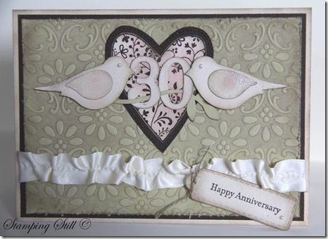
I had been asked to make a special 30th wedding anniversary card and I thought distressed would be nice but I didn’t want to go “too over-board” with it because I didn’t know the couple it was going to.  So I made it distressed and pretty at the same time!
I decided to use my Always heart, I haven’t used it for a while and I had forgotten how beautiful it is.  I realised too that it would team beautifully with the finial press embossing folder.  I brayered crumb cake ink onto the folder before putting the river rock in and running it through the big shot. Then I distressed this piece further with a sanding block. The heart is embossed with espresso on 2 layers and cut out.  I distressed all edges using crumb cake and sponged some pretty in pink onto the heart and birds.  I also added some champagne shimmer paint to their wings and tails.  I pulled a thread in the vanilla satin ribbon to give it a vintage look too.
Oh and there had to be pearls because your 30th anniversary is a pearl one if you didn’t already know. I didn’t, I had to look it up :)

Ingredients :
Stamps : Always, teeny tiny sentiments
Card : river rock, naturals ivory, espresso, very vanilla
Ink : espresso, crumb cake, pip
Other :  clear embossing powder, sanding block, daubers, champagne shimmer mist, pearls, bird punch, big shot, lots of tags, finial press, linen thread, brayer, vanilla satin ribbon, timeless type junior alpha

The person who ordered the card was very happy with it when she saw it and she told me later that the anniversary couple truly loved it, they said it was just so beautiful.  Yeah!!!  Love a happy ending!

SU-Creative-Crew
As for the Creative Crew challenges there are 4 each month.
I’m not showing you all my cards at once though :)
This one is for:
CCREW0511CF, CreativeCrew, SUO or SUM - Catalog Focus -- So Distressing. Use the Distressing Essentials kit, cutter kit, sponges, daubers. Make the new look old.
If you would like to join us and make a distressed card, just upload it to Splitcoaststampers and use the writing here in bold as your keywords.  It is probably easier if you just copy and paste these keywords from my blog.  Just get rid of either SUO or SUM.  The aim of the creative crew challenges is to get more stampin up cards into the gallery.  So cards are Stampin Up Only if possible, or Stampin Up Mostly (using 95% SU). Once you have posted this into the keyword section you upload to splitcoast as usual and you can add extra words to the keyword line such as what stamps you used too.
These challenges run for all of May and then 4 new challenges will be set.
If you have any questions just drop me an email.
I will let you know about one of the other challenges now too.  It’s a scrapbooking challenge and I’m not entering this one.  If a crew member decides to not enter one of the challenges then they enter 2 cards into one of the other challenges instead :)  So if you’re up for a scrapbooking challenge here it is :
CCREW0511SF, CreativeCrew, SUO or SUM - SB Inspiration Focus: -- Vintage Pages. We want to see black and white or Sepia photo's! We want the page to look like it's from a by-gone era, think antiquing, distressing, lace, etc.
Hope some of you can play along with us Crew members this month.
Kathy

Wednesday, February 23, 2011

50 wishes

I was asked to make a birthday card for the librarian at my daughters’ school this week.  I saw a wonderful sketch challenge at Paper Players and decided to use that as my inspiration.
image 

She was turning 50 and I could have put a big 50 on it, but decided against it.  I wanted to make it look special though so I thought I would do those lovely ribbon flowers again.  This time I used the 1” circle punch for one of the flowers so that I had 2 different sizes, as in the sketch.

IMG_0909

The card was for all the staff at school to sign, so I felt a bit stressed about it.  Hopefully she liked it and the rest of the staff did too!

Ingredients :
Stamps : Sincere salutations
Card : regal rose, pip, pink pirouette, very vanilla, espresso, crumb cake
Ink : espresso, crumb cake, river rock
Other : big shot, finial press, polka dot, lots of tags, rhinestone brads, rhinestones, beautiful wings, wide oval punch, little leaves, pip satin ribbon, sticky strip, circle punches, thin espresso taffeta ribbon

My Think Pink card won another challenge at SUO Challenges this week too!  Very exciting!
Kathy

Sunday, January 16, 2011

Watercolour friend


Well, I haven’t posted anything for a while because I have been on holidays and just got home yesterday.  We went to 9 mile beach at Swansea and it was really beautiful.  We had absolutely awful weather (but I really can’t complain because a lot of people in Australia had it much worse than us last week that’s for sure!!!)

holiday


This is the girls enjoying the beach.  Can you imagine having a beautiful beach 9 miles long all to yourself?  That’s what we had right at our back door, it was wonderful.  We will have to go back again sometime soon and hope for some better weather.

The day we arrived was nice and the day we left.  In between it rained but luckily I had looked at the forecast before we went and knew it was meant to be awful, so I packed some stamping supplies for the girls and I to play with.  I took my Nicest Things set to do some watercolouring and when I got back I found a wonderful sketch challenge at Inkspirations that I thought would work well with the image.  Then I spent way too long making this card today rather than do the boring things that needed doing like cleaning, washing and unpacking!

Picture 152


Ingredients :

Stamps : The Nicest Things

Card : Choc chip, watercolour paper, very vanilla, baja blue, retired dsp

Ink : stazon, crumbcake, celery, baja, razzleberry, choc, pip, marina mist, blush blossom, neutrals crayons

Other : big shot, finial press, choc chip button, linen thread, aquapainter, scallop trim border punch


Praying that everyone affected by the floods has a friend, or makes a new one, to help them during this difficult time.


Kathy

Monday, October 25, 2010

Black magic challenge


The challenge at Just Add Ink this week is a colour challenge.

You needed to use bashful blue, sahara sand, blushing bride and pear pizzazz.

These colours do look very pretty together and it’s great to be challenged to use different colour combinations.

Watercolour pencils are not exact Stampin’ Up colours but the green I used for the swirly leaves is extremely close to the pear pizzazz colour.

There was also a great sketch challenge at Stamping411 this week and I decided to combine the two. So it is a double challenge with a black magic twist.

I still didn’t challenge myself to do the black magic technique on something other than a flower BUT I thought I had enough challenges for one day!


Picture 041


Ingredients :

Stamps : Elements of Style, All a flutter, Occasional greetings

Card : Bashful blue, sahara sand, black, white, blushing bride, vellum cardstock

Ink : stazon, white craft, bashful blue and choc chip marker for butterfly

Other : big shot, finial press folder, white pen, bashful blue taffeta ribbon, hodgepodge hardware, watercolour pencils,

Thursday, September 23, 2010

Another reinker card

I’ve made another card using the embossed reinker spread technique and Fifth Ave Floral for a fundraiser I’m involved in.
Rhonda Statham, a Stampin’ Up! demonstrator from NSW, has organised a Big Shot die sample booklet as a fundraiser to help a friend with the cost of buying a continuous glucose monitoring system for her son who has diabetes.
Demonstrators from all over Australia are helping out by providing samples of Big Shot die cuts and cards made using them. Rhonda is then turning these into a pdf file for other demonstrators to purchase.
It will be a great tool to have, so that you can see the actual size of the dies and what can be done with them.
I was very happy to help out.
My job was to provide die cuts of the Bigz Simple Numbers Alphabet and some card samples.
This is one of them and I’ll show you the other later on in the week.
I didn’t use a new stamp set but there are a lot of new goodies from my recent HUGE order on it!
I cut the 70 out of some thick packing cardboard I found using Bigz Simple Numbers and it cut perfectly.  I then painted it with a mixture of pip reinker and my new frost white shimmer paint. I used my new Finial Press embossing folder for the background and dabbed a little of the paint mixture on to the raised areas of the embossed piece.  I used the new shimmery white card for the flowers, the base and the top note piece (very pretty) and used the new organza ribbon too!

Picture 314
Ingredients :
Stamps : Fifth Ave Floral
Card : Shimmery white, pink pirouette, river rock
Ink : shimmer paint white, reinkers, versamark
Other : organza ribbon, big shot, bigz simple numbers, finial press folder, dauber, little leaves, top note, white embossing powder, heat gun