Pages

Showing posts with label bird punch. Show all posts

Friday, October 5, 2012

Blissful Starfruit


At Just Add Ink this week we have a colour challenge.

JAI_CC_#138


I must say I did find it challenging.  It’s the first time I’ve used any of the new in-colours and I haven’t bought any inks or markers (as yet anyway). I did have the cardstock though and so I decided to white emboss over the top of it.


IMG_5238


I used a few new goodies from my big SU spending spree in September on this card.

The ornament keepsakes bundle, delicate designs folders, good cheer wheel and Blissful Bird.

When I had worked out my order and was just about to submit it, I looked down at the catalogue which was open at the page with this bird on it and on a whim decided I had to add it too.  I hadn’t even noticed it before, even though I’d looked over the catalogue hundreds of times and agonised over what to buy.  Possibly because it is on the same page as the stamp I wanted most of all - Poppies.  Anyway when I saw it I thought it would make a great Christmas bird, even though SU haven’t put it in the Christmas section, that’s what I think it is.  I thought he might look great holding one of the ornaments.


Ingredients :

Stamps : Ornament Keepsakes, Blissful Bird, Good Cheer wheel

Card : confetti white, basic grey, starfruit

Ink : white

Other : white ep, big shot, holiday ornaments, delicate designs ef, bakers twine, sewing machine, bird punch, square lattice ef


It’s an unusual colour choice for a Christmas card I know, but I think it works.

Please take a look at what the rest of the team at JAI have come up with this week.  There are some gorgeous creations to inspire you.


Kathy

Friday, June 15, 2012

Marina Flower


This week at JAI our challenge is to case Delys.
And this is the card I decided to case, isn’t it pretty!


My next club hostess asked if I would teach them how to make the ribbon flowers I do. So I thought I would case this card and use a ribbon flower rather than the punched flower as Delys has done.

IMG_4465

When I was reading Delys’ description of the card, she said her background panel was done using a technique called Crayon Resist Technique.  It didn’t look like what I think of as crayon resist. I thought of the Crayon Resist tutorial done by Danielle Daws for JAI here if you’d like to see it.  So I decided to google the term to see if I could figure out how Delys had created her background. 

I didn’t find it but I did find a technique called Crayon Rubbed Embossing that I had never seen before. I thought it looked very effective and so I decided to try it on my card instead but I have used the same embossing folder as Delys.  There is a Splitcoaststampers tutorial by Lydia Fiedler here if you’d like to try it too. It is a very different way of using your embossing folders.  I really like how it turned out and  now I will be able to teach my club ladies 2 beautiful new techniques this month :)

Ingredients :
Stamps : sincere salutations
Card : white, basic grey
Ink : stazon, marina mist
Other : marina mist satin ribbon, antique brad, white crayon, brayer, finial press ef, bird punch, scallop trim border punch

Please check out Delys’ blog and join us in casing one of her creations.

Kathy

Monday, August 1, 2011

Friendly Language


This is a card I made for the new round of challenges at the Splitcoast Stampers Creative Crew.

This month the theme is Friendship and this card is for a colour challenge.

CCREW0811DF, CreativeCrew, SUO or SUM – DSP/Color Focus: Pocketful of Posies designer papers (122354), or the following colors: baja breeze, daffodil delight, early espresso, night of navy, pear pizzazz, poppy parade, rich razzleberry, so saffron, soft suede, whisper white. Choose any 3 of these colors and make a friendship project—remember, sisters can also be friends!


IMG_2073


This card uses a set called Language of Friendship which will be available in the new catalogue which is released September 1. 

Isn’t it pretty!  It uses the 2-step bird punch and the boho blossoms punch, so no cutting necessary :)


Ingredients :

Stamps :  Language of friendship

Card : baja, espresso, vanilla

Ink : espresso, baja

Other :  big shot, elegant lines, boho blossoms punch, bird punch, pearls


August is retirement month at Stampin Up.  It’s kind of sad because some of my favourite sets are retiring, (Pun Fun, sob!)  but it’s exciting too because we’ll have lots of lovely new sets to play with very soon!

If you’d like to take a look at the retirement list click here.  These things will never be available again and there are some good savings to be had too :)  Please email me if you’d like to place an order.


Kathy

Friday, June 17, 2011

Wedding birds


This is my final card for this months Splitcoast Stampers Creative Crew.

CCREW0611HF, CreativeCrew, SUO or SUM - Holiday/Seasonal Focus: *Love Birds* It wouldn't be right to have June, weddings, flowers, etc without the birds! Let this Love Birds Shower Ensemble inspire you! You do not have to do wedding cards, however you must use a bird.


IMG_1777


I decided to try using the Awash with Flowers set in a different way.  I embossed it with silver ep on white.  It looks very pretty in real life but the photo doesn’t really capture it.

The other new thing I tried on this card was the bow.  I made a double bow from organza ribbon, attached it with a vintage brad and then used my heat gun to “melt” it a little (like I do with the ribbon flowers).  It gave it a lovely “shabby chic” look.


Ingredients :

Stamps : awash with flowers, teeny tiny sentiments

Card : white, black, shimmery white

Ink : versamark

Other : silver embossing powder, pearls, bird punch, big shot, tulip embossing folder, organza ribbon, antique brad, word window punch, modern label punch


Kathy

Monday, June 13, 2011

Party Owl

This is another card for this month’s Creative Crew colour challenge.
CCREW0611DF, CreativeCrew, SUO or SUM - DSP/Color Focus:
*Sunny Garden*
June, a time for iced tea, gardens bursting, and riots of color. This month we're going bright.  Poppy Parade, Daffodil Delight, Pear Pizzazz, Peach Parfait.

IMG_1778

I decided to use my new owl punch again cause he’s so cute!
I used a stamp from Party Hearty for the “Celebrate”.  I masked it to just get the part I wanted.  I punched a circle for the balloon and used crystal effects on it to make it shiny.  I cut a little end piece for the balloon and tied linen thread to it and the owl’s wing. I also just cut a triangle for his party hat.
When I showed this card to my friend Mae (who is also on JAI) she said :
“How did you make the end of the balloon?”
I told her I had just cut it and she said:
“Oh I thought you might have used one of the owl’s feet for it.”
Brilliant!!!
Why didn’t I think of that.  Anyway I’ll know what to do next time.  Thanks Mae.

Ingredients :
Stamps : Party Hearty
Card : black white, pear, poppy, crumb cake, hostess dsp stack, brights dsp stack
Ink : stazon
Other : owl punch, circle punch, linen thread, dimensionals, crystal effects, bird punch, scallop oval punch

These are definitely not my kind of colours …. but I really like how this card turned out. 
Kathy

Sunday, May 1, 2011

Pearl Wedding

This is the first card I made for the Splitcoast Stampers Creative Crew challenge.
The brief was to use Stampin Up products to give a card a distressed look.
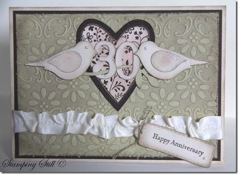
IMG_1099

I had been asked to make a special 30th wedding anniversary card and I thought distressed would be nice but I didn’t want to go “too over-board” with it because I didn’t know the couple it was going to.  So I made it distressed and pretty at the same time!
I decided to use my Always heart, I haven’t used it for a while and I had forgotten how beautiful it is.  I realised too that it would team beautifully with the finial press embossing folder.  I brayered crumb cake ink onto the folder before putting the river rock in and running it through the big shot. Then I distressed this piece further with a sanding block. The heart is embossed with espresso on 2 layers and cut out.  I distressed all edges using crumb cake and sponged some pretty in pink onto the heart and birds.  I also added some champagne shimmer paint to their wings and tails.  I pulled a thread in the vanilla satin ribbon to give it a vintage look too.
Oh and there had to be pearls because your 30th anniversary is a pearl one if you didn’t already know. I didn’t, I had to look it up :)

Ingredients :
Stamps : Always, teeny tiny sentiments
Card : river rock, naturals ivory, espresso, very vanilla
Ink : espresso, crumb cake, pip
Other :  clear embossing powder, sanding block, daubers, champagne shimmer mist, pearls, bird punch, big shot, lots of tags, finial press, linen thread, brayer, vanilla satin ribbon, timeless type junior alpha

The person who ordered the card was very happy with it when she saw it and she told me later that the anniversary couple truly loved it, they said it was just so beautiful.  Yeah!!!  Love a happy ending!

SU-Creative-Crew
As for the Creative Crew challenges there are 4 each month.
I’m not showing you all my cards at once though :)
This one is for:
CCREW0511CF, CreativeCrew, SUO or SUM - Catalog Focus -- So Distressing. Use the Distressing Essentials kit, cutter kit, sponges, daubers. Make the new look old.
If you would like to join us and make a distressed card, just upload it to Splitcoaststampers and use the writing here in bold as your keywords.  It is probably easier if you just copy and paste these keywords from my blog.  Just get rid of either SUO or SUM.  The aim of the creative crew challenges is to get more stampin up cards into the gallery.  So cards are Stampin Up Only if possible, or Stampin Up Mostly (using 95% SU). Once you have posted this into the keyword section you upload to splitcoast as usual and you can add extra words to the keyword line such as what stamps you used too.
These challenges run for all of May and then 4 new challenges will be set.
If you have any questions just drop me an email.
I will let you know about one of the other challenges now too.  It’s a scrapbooking challenge and I’m not entering this one.  If a crew member decides to not enter one of the challenges then they enter 2 cards into one of the other challenges instead :)  So if you’re up for a scrapbooking challenge here it is :
CCREW0511SF, CreativeCrew, SUO or SUM - SB Inspiration Focus: -- Vintage Pages. We want to see black and white or Sepia photo's! We want the page to look like it's from a by-gone era, think antiquing, distressing, lace, etc.
Hope some of you can play along with us Crew members this month.
Kathy