Pages

Showing posts with label lots of tags. Show all posts

Friday, June 29, 2012

The sky’s the limit


This week at Just Add Ink we have a colour challenge.

JAI_CC_#124

I used these colours to make a 21st birthday card for my nephew.


IMG_4450


I sponged clouds using marina mist and I also sponged some grassy hills using wild wasabi.

I stamped and clear embossed the balloons with espresso onto espresso dsp and cut them out but stamped the baskets onto the card itself. I sponged a little espresso around the edges of the balloons too.

The sentiment comes with the set and I thought it was quite appropriate for a 21st birthday.


Ingredients :

Stamps : up up and away

Card : espresso, marina mist, wasabi, white, neutral dsp stack

Ink : espresso, versamark, wasabi, marina, crumb cake

Other : clear embossing powder,  espresso taffeta ribbon, oval punch, lots of tags, big shot,  timeless type junior alpha


A 21st card for a male is pretty hard to do I think, but I was quite pleased with how this turned out.

I would never have chosen these colours together and that’s why colour challenges are so wonderful. They “make” you try something new.  I hope you’ll take a look at what the rest of the JAI team have created this week and give this combo a try yourself.


Kathy

Monday, October 24, 2011

Lovely wisteria trees


This is another one of the cards we made at the Christmas stamp-a-stack I held.

IMG_2623


It is using my new Lovely as a Tree set again and this tree is gorgeous too.

This is not an original idea.  I always have a look at the stampin up galleries on splitcoaststampers when I buy a new set to get some inspiration and to see different ways people have used it. Well this general idea has been done by a lot of people so I’m not sure who originally thought of it to give them credit but I’m pretty sure I’m the only person to have made this card in wisteria wonder at least!

Ingredients :

Stamps : lovely as a tree, occasional greetings

Card : black, white, wisteria wonder

Ink : wisteria, stazon

Other : wisteria ribbon, wide oval punch, big shot, lots of tags


This card is very easy to make but still looks beautiful.  The ladies at the stamp-a-stack really liked this one and they liked the colour a lot too.


Kathy

Friday, May 13, 2011

Beecoming 18


As the current challenge at Just Add Ink is still going, I thought I would show you another of my Creative Crew challenge cards.

IMG_1520

CCREW0511DF, CreativeCrew, SUO or SUM - DSP/Color Focus:
-- Go neutral with a splash of color! Instead of whisper white or very vanilla, try naturals white or ivory, confetti white or cream. Large emphasis on neutrals. Look to the Elegant Soiree DSP this month for inspiration: All neutrals with that splash of baja breeze! You do not have to use the Elegant Soiree DSP but that is the look that we're after.


I used naturals ivory, baja and suede for the colour challenge.  The dot background was made by brayering baja ink onto the dot embossing folder and putting naturals ivory through the big shot.


Ingredients :

Stamps : Nature walk, so swirly, something sweet

Card : suede, naturals ivory

Ink : suede, crumb cake. baja

Other : big shot, polka dot folder, lots of tags, timeless type alpha, linen thread, neutrals brad


This is for my niece who is about to beecome 18 :)

Hope she likes it.

Kathy

Tuesday, May 10, 2011

Family Nature


Just thought I’d show you another challenge from the Splitcoast Stampers Creative Crew.

With this one you have to choose a layout and make a male and female card with it, while keeping the “antique” theme for this month.

CCREW0511HF, CreativeCrew, SUO or SUM - Holiday/Seasonal Focus -- Family Time! Mom's and Dad's days are here, but let's not forget about the Grandmas and Grandpas either. This month we're doing a his & hers challenge. Choose one layout and make a masculine card and a feminine card!

I decided to use Nature Walk and my grid technique to make a male card.  This one was for my Brother in law’s birthday.  I distressed this one quite a lot to try to make it more “manly”. I used the music notes wheel on the crumb cake and really scrunched it and then sponged crumb cake on it.

IMG_1119 

Ingredients : 

Stamps :  Nature walk, music notes, teeny tiny sentiments, sanded

Card : vanilla, naturals ivory, crumb cake, espresso

Ink :  crumb cake, espresso, river rock

Other :  linen thread, mini library clip, sponges, post its, big shot, lots of tags


Then this one is using the same layout but was for my Mum for Mother’s Day, so a “girly” version. For the challenge you didn’t need to use the same stamp set, but I love my new Nature Walk set so much I just had to!  


IMG_1133

Ingredients :

Stamps : Nature walk, very vintage, teeny tiny sentiments

Card : Espresso, vanilla, pink pirouette

Ink : pip, crumb cake, espresso

Other : linen thread, espresso thin taffeta, word window punch, modern label punch, pearls, pip button, big shot, square scallop die, sponges, post its


Kathy

Sunday, May 1, 2011

Pearl Wedding

This is the first card I made for the Splitcoast Stampers Creative Crew challenge.
The brief was to use Stampin Up products to give a card a distressed look.
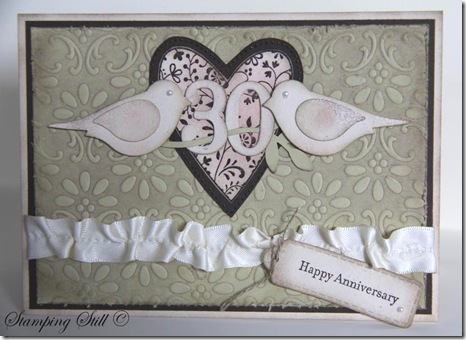
IMG_1099

I had been asked to make a special 30th wedding anniversary card and I thought distressed would be nice but I didn’t want to go “too over-board” with it because I didn’t know the couple it was going to.  So I made it distressed and pretty at the same time!
I decided to use my Always heart, I haven’t used it for a while and I had forgotten how beautiful it is.  I realised too that it would team beautifully with the finial press embossing folder.  I brayered crumb cake ink onto the folder before putting the river rock in and running it through the big shot. Then I distressed this piece further with a sanding block. The heart is embossed with espresso on 2 layers and cut out.  I distressed all edges using crumb cake and sponged some pretty in pink onto the heart and birds.  I also added some champagne shimmer paint to their wings and tails.  I pulled a thread in the vanilla satin ribbon to give it a vintage look too.
Oh and there had to be pearls because your 30th anniversary is a pearl one if you didn’t already know. I didn’t, I had to look it up :)

Ingredients :
Stamps : Always, teeny tiny sentiments
Card : river rock, naturals ivory, espresso, very vanilla
Ink : espresso, crumb cake, pip
Other :  clear embossing powder, sanding block, daubers, champagne shimmer mist, pearls, bird punch, big shot, lots of tags, finial press, linen thread, brayer, vanilla satin ribbon, timeless type junior alpha

The person who ordered the card was very happy with it when she saw it and she told me later that the anniversary couple truly loved it, they said it was just so beautiful.  Yeah!!!  Love a happy ending!

SU-Creative-Crew
As for the Creative Crew challenges there are 4 each month.
I’m not showing you all my cards at once though :)
This one is for:
CCREW0511CF, CreativeCrew, SUO or SUM - Catalog Focus -- So Distressing. Use the Distressing Essentials kit, cutter kit, sponges, daubers. Make the new look old.
If you would like to join us and make a distressed card, just upload it to Splitcoaststampers and use the writing here in bold as your keywords.  It is probably easier if you just copy and paste these keywords from my blog.  Just get rid of either SUO or SUM.  The aim of the creative crew challenges is to get more stampin up cards into the gallery.  So cards are Stampin Up Only if possible, or Stampin Up Mostly (using 95% SU). Once you have posted this into the keyword section you upload to splitcoast as usual and you can add extra words to the keyword line such as what stamps you used too.
These challenges run for all of May and then 4 new challenges will be set.
If you have any questions just drop me an email.
I will let you know about one of the other challenges now too.  It’s a scrapbooking challenge and I’m not entering this one.  If a crew member decides to not enter one of the challenges then they enter 2 cards into one of the other challenges instead :)  So if you’re up for a scrapbooking challenge here it is :
CCREW0511SF, CreativeCrew, SUO or SUM - SB Inspiration Focus: -- Vintage Pages. We want to see black and white or Sepia photo's! We want the page to look like it's from a by-gone era, think antiquing, distressing, lace, etc.
Hope some of you can play along with us Crew members this month.
Kathy

Friday, April 15, 2011

50th Chocolate


The challenge this week at Just Add Ink is to create a card using the colours from your favourite chocolate wrapper.  It was very hard to come up with a favourite chocolate because I pretty much love them all.  I am addicted to chocolate! (Just not the white stuff – I’d have to be really desperate to eat that.)

I decided to go with my favourite “everyday chocolate” the kind I see at the check out and can’t resist buying.  Not the “really special” kind.

Can you tell what it is from the colours?


IMG_1020


I was asked to make a card for the Principal at the school where I work (and my girls go there too).  It was a big birthday occasion as you can see and I was told that they didn’t think she’d like a “flowery” card!  Well that made it kind of hard because I would have done flowers plus it needed to be very special.

So I decided to use the Birthday Bakery set, I thought the saying might be just right for this occasion.  I thought it should fit well with this colour challenge too, because I had to use red and chocolate.  Have you worked out my favourite chocolate yet?  It’s Cherry Ripe.

I had pretty much designed and made most of the card using real red card and dsp, choc chip card for the border and coloured in the cakes using choc, real red, pip and regal rose.  I used choc chip ink to stamp the 50 and the saying and then thought “maybe I should find a photo of a cherry ripe on the internet just to be sure”.

Well do you realise there is yellow on the pack and no brown!  I couldn’t believe it!  I obviously associate the chocolate colour with the pack but you don’t actually see chocolate until you open the wrapper.  Yellow!….. Well I tried putting some yellow card on it and “YUK” is what I thought.  So I decided to colour the cake stands daffodil delight and the string from the tag is yellow embroidery cotton.  You can’t see the yellow much in the photo, but it was just enough to look nice without clashing with the red.  I had to leave the choc chip colour on there though because to me that really is the colour of cherry ripe.

Ingredients :

Stamps : Birthday bakery, Calendar alpha and numbers

Card  :  Real red, choc chip, shimmery white, brights dsp stack

Ink  :  Choc chip, markers, red, choc, crumb cake, pip, regal rose, daffodil, celery

Other  :  red satin ribbon, build a brad, circle punch, big shot, lots of tags


The red satin bow made this card and really looked like the wrapper – so gorgeous and shiny.

Why not make a card using your favourite chocolate wrapper colours and enter the challenge at Just Add Ink? Or at least visit there and drool over the design team’s very yummy creations.

Kathy

Wednesday, March 9, 2011

Easter bunny case


I decided to make a cute little Easter card for the weekly challenge at Just Add Ink.  The challenge was to case a card from one of their founders.  Although both Amanda and Danielle have gorgeous cards, I decided to case Danielle.

It’s not an exact copy but it is definitely in her style.  I had the card fold at the top (which I rarely do, but she does quite a lot) and corner rounded the card at the bottom (another element that features strongly in her cards).  Other similar elements to hers are the clear embossing on the top third of the card and having a pretty bow.  I really like Danielle’s style – Clean and Simple and Gorgeous.

IMG_0979

Ingredients :

Stamps : nicest things, teeny tiny sentiments

Card : river rock, watercolour, old olive

Ink : versamark, stazon

Other : watercolour crayons, aquapainter, ribbon (retired), clear embossing powder, wide oval punch, big shot, lots of tags, dimensionals

Making this card gives me the feeling of being really organised and ready for Easter, but Phew! I only just got this done in time for the challenge!  So I’m not really that organised!

Kathy

Wednesday, February 23, 2011

50 wishes

I was asked to make a birthday card for the librarian at my daughters’ school this week.  I saw a wonderful sketch challenge at Paper Players and decided to use that as my inspiration.
image 

She was turning 50 and I could have put a big 50 on it, but decided against it.  I wanted to make it look special though so I thought I would do those lovely ribbon flowers again.  This time I used the 1” circle punch for one of the flowers so that I had 2 different sizes, as in the sketch.

IMG_0909

The card was for all the staff at school to sign, so I felt a bit stressed about it.  Hopefully she liked it and the rest of the staff did too!

Ingredients :
Stamps : Sincere salutations
Card : regal rose, pip, pink pirouette, very vanilla, espresso, crumb cake
Ink : espresso, crumb cake, river rock
Other : big shot, finial press, polka dot, lots of tags, rhinestone brads, rhinestones, beautiful wings, wide oval punch, little leaves, pip satin ribbon, sticky strip, circle punches, thin espresso taffeta ribbon

My Think Pink card won another challenge at SUO Challenges this week too!  Very exciting!
Kathy

Thursday, January 20, 2011

Here for you

Well I’ve been wasting time this week, crafting and checking out my favourite blogs and finding lots of lovely new ones as well!  I found a challenge site called The Paper Players and they have a colour challenge this week. Their design team have created so many stunning cards, it inspired me to try these colours together too. 
 image
I thought I would try the grid technique again but this time use 2 colours Baja Breeze and River Rock.  I also stamped the blossoms from Elements of Style onto watercolour paper, coloured them and cut out a couple to attach to the tag.

IMG_0786

My daughter’s violin teacher had to go to hospital for knee surgery just before Christmas, she is back home now and we might go and visit her next week if she’s up to visitors.  I thought I might make a couple more cards using the grid technique and give them to her as a little gift from us.  The last time I gave her a few cards it made her so happy, she said they were so beautiful and hopefully she’ll really like these grid ones too.
Kathy

Ingredients :
Stamps : Elements of Style, music notes wheel, friendly words wheel, very vintage wheel, vintage vogue, friends 24-7
Card : very vanilla, baja breeze, naturals ivory, rose red, watercolour paper
Ink : baja breeze, river rock, rose red, stazon
Other :  pearl, embroidery thread, river rock ribbon (retired) mat pack, aquapainter, big shot, lots of tags, wide oval punch, sponges

Friday, October 22, 2010

Black magic with a twist

I thought I would try the Black magic with a twist technique on my Apple Blossoms set. 
It’s a very simple technique and a simple card but I like it.
I think it is “fresh” and pretty.  Clean and simple.
I have only tried this technique once before on a birthday card for my daughter. It used a flower from Eastern Blooms and was very pretty too.
Did you know that there is a link on my blog to my splitcoaststampers gallery?  All of my “older” cards are there as well as all the cards I now make and show on my blog.
Maybe I should try using this technique on something that isn’t a flower sometime and see how it looks?  You just need it to be a stamp with some solid area on it so that you can “colour” it in.

Picture 032

Ingredients :
Stamps : Apple Blossoms (level 2 hostess set)
Card : black, whisper white, confetti white, perfect plum, marina mist
Ink : white, black stazon
Other : watercolour pencils, white gel pen, big shot, polka dot, lots of tags, white ribbon, wide oval punch

Saturday, October 9, 2010

Final one sheet wonder


Well my daughter’s violin eisteddfod was on this week and she got a merit certificate (YEAH!!!)

I packaged the one sheet wonder cards up in this Card Folder to give to her teacher and accompanist.  They thought they were beautiful.

It’s so nice to give and receive hand-made presents!

I got the instructions for the card folder from  

http://makeeshabyl.com.au

She has some great stuff on her blog.

The 3 cards fitted in well, but if I had put less ribbon and bling on them I could have fitted in one or two more I think.

It was very easy to make and was a nice way to package the cards.                              

Picture 353 


This is how it looks on the inside.  The ribbon holds it closed and keeps the cards in place.

Picture 358


There are violin exams on very soon too and I’ll have to come up with another gift for them !!!  I’d better get off this computer and start thinking, umm……….


Ingredients:

Stamps : Awash with flowers, Apple Blossoms (level 2 hostess set)

Card : bashful blue 12”, early espresso, whisper white

Ink : early espresso, bash blue, regal rose, pip, wasabi, marina mist

Other : word window punch, lots of tags die, big shot, bashful blue ribbon, cropadile, brad, dimensionals

Monday, September 27, 2010

Another number card

My youngest daughter has another birthday party to go to next week and I thought I would try to make something different. I decided to use Party Hearty again and try making a side-step card.
I’m not totally happy with it, but I will try them again sometime, it wasn’t difficult.
Anyway she loved it and thought her friend would too.  It’s pretty easy to please a 5 year old girl as long as there’s pink on the card I guess!

Picture 326

Ingredients:
Stamps : Party Hearty, Something Sweet, Confetti
Ink : Melon Mambo, pip, crumb cake, versamark
Card : razzleberry, melon mambo, pink pirouette, white
Other : heat and stick powder, dazzling diamonds, big shot, simple numbers die, lots of tags die, rhinestones, 2 way glue pen, hodgepodge hardware, pip taffeta ribbon

Friday, September 24, 2010

6 Little Monkeys

This is the other card I made for the Big Shot Fundraiser.
My youngest daughter turns 6 next year and I thought I might give it to her as her favourite colour is pink, and I knew she would like the “bling” on the party hats.  I also knew that if I came up with something else in the meantime that there would be lots of parties to go to next year with her friends all turning 6 too.
Well she saw it and loved it, but was disappointed and sad when I said I might give it to her for her next birthday. Why?  Well because she had already seen it and she wants a surprise!!! She had a think and said perhaps she might forget about it by then (April) so then all was good with the world again and she was happy !!!!
Picture 321
This card uses some of my new goodies too!
The numbers die, lots of tags die and although Party Hearty is not new I only just got it. The rhinestones are new and look so gorgeous on top of the party hats.  I’ve also used Early Espresso (a new colour) for the monkeys.  I didn’t really think I needed another brown (I love choc chip) but actually I really love this new one!  I also used melon mambo which I haven’t used before and paired it with old olive, which I couldn’t get my head around being a bright, but actually they look great together.
Ingredients :
Stamps : Fox and Friends, Upsy Daisy, Party Hearty
Card : whisper white, pip, melon mambo, old olive
Ink : melon mambo, early espresso, old olive marker
Other : big shot, lots of tags, simple numbers, rhinestones, dimensionals