Pages

Sunday, August 28, 2011

Daffodil Thanks


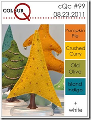
I saw this great challenge at ColourQ this week.
They’re not colours I would generally put together but I loved the look of the inspiration photo so much I just had to give it a try.
image

Friday was daffodil day in Australia and I made some little daffodils from punches, coated them with crystal effects and made them into brooches for my daughters to wear to school.  They were having a yellow day to raise money and awareness about cancer.
I made an extra one too so that I could put it on a card and use it for this colour challenge.

IMG_2353

The blue is a new in colour called island indigo and it looks so beautiful with the yellow.  Actually, I didn’t have crushed curry unfortunately and used daffodil delight instead.  Amazingly it’s the perfect colour to make daffodils with, ha ha :)
After using the framed tulips embossing folder on the indigo I used my white craft ink to go over the top of the embossing and a little on the inside panel which gave it a kind of distressed (shabby chic) look.
I stamped the foliage in daffodil and then also embossed some with white embossing powder.

Ingredients :
Stamps : Just believe, for everything
Card : confetti white, white, daffodil, island indigo, pumpkin pie
Ink : white, stazon, daffodil, versamark, pumpkin
Other : old olive ribbon, white brad, big shot, tulip folder, blender pen, crystal effects, 5 petal flower punch, 3 flower punch, white embossing powder

I think these colours work great for a bright and happy card.  I am so glad I entered this challenge, I will definitely use these colours again.

Kathy

Friday, August 26, 2011

Ribbon stash


This week at Just Add Ink the challenge is to make a card with something you’ve had in your stash for ages and haven’t used.

In my stash was a beautiful roll of marina mist satin ribbon that hadn’t been touched and so I decided to make another one of those ribbon flowers with it.

IMG_2240


I thought I would take the opportunity to use some retiring things too. Sadly this ribbon is retiring as are the two stamp sets I’ve used on the card.  I used white craft ink to stamp the flourish from friends 24-7 and the words are from a hostess set called Apple Blossoms.  Sad to see them go :(  But I will have lots of lovely new sets to play with very soon :)


Ingredients :

Stamps : friends 24-7, apple blossoms, very vintage wheel

Card : espresso, marina mist, white, crumb cake

Ink : white, crumb cake, espresso, marina

Other : marina mist satin ribbon, sticky strip, circle punch, espresso thin taffeta ribbon, crochet trim, big shot, square scallop, neutral brad, vintage brad, white pen


I love how the ribbon flower turned out in marina mist, I will have to make some more of them.

I’m sure we’re all guilty of buying “stuff” for our craft and then not using it.  Please have a look at what the rest of the design team at JAI have been hoarding. Then, as shocking as this sounds, I challenge you to actually take something from your stash and MAKE something with it.


Kathy

Saturday, August 20, 2011

Embossing 4 ewe


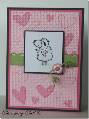
This is the other card we did at club last week using the inset embossing technique.

Isn’t it cute!

IMG_2211


I also showed the ladies how to do the “squiggly button thingy” technique.

Not quite sure if that’s its correct name. Ha ha :)


Ingredients :

Stamps : pun fun

Card : pink pirouette, pip, regal rose, basic grey, celery, confetti white

Ink : pip, stazon

Other : crayons, aquapainter, button, white pen, piercer, big shot, square lattice ef, heart to heart punch, scallop trim border punch


I can’t believe Stampin Up are retiring Pun Fun!!!

It was the first set I chose as a demo.  I loved it and still do!

It’s a keeper for sure.


Kathy

Thursday, August 18, 2011

Father’s eggs


For our stamp club last week the hostess asked if I could show them a technique with the big shot embossing folders and if we could make it a Father’s Day Card.

So I decided to teach them Inset Embossing and this is the card some of the ladies made.

IMG_2230

Of course I used the Teeny Tiny Sentiments set so that they could change the sentiment and make it for whatever occasion they liked.

The ladies were pretty “wowed” by this technique.  It is so easy but very effective.


Ingredients :

Stamps :  Teeny tiny sentiments, nature’s nest

Card :  espresso, artichoke, crumb cake, confetti white, white

Ink :  stazon, crumb cake, artichoke

Other : big shot, square lattice ef, little leaves, window punch, modern label punch, aqua painters, crayons, neutral brads


Generally, for my stamp club, I do 2 different cards that use the same technique.  I will show you the other one later on this week.


Kathy

Monday, August 15, 2011

Look Whoo


This is my last card for the Splitcoast Stampers Creative Crew.

CCREW0811HF, CreativeCrew, SUO or SUM – Holiday Focus:

You had to use this sketch, the paper piercing tool and choose 3 colours from this selection : baja breeze, daffodil delight, early espresso, night of navy, pear pizzazz, poppy parade, rich razzleberry, so saffron, soft suede, whisper white.

image

It was also meant to be for Friendship Day, Sister’s Day or Family Day which are celebrated on the first Sunday in Aug.

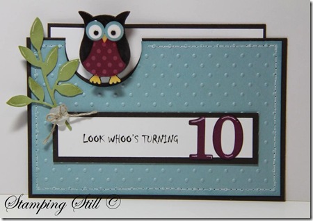
Well I did something a little different and made a card for my daughter’s 10th birthday instead, which just so happened to be on the first Sunday in August too!

IMG_2112


I decided to make a little owl brooch for her and attach it to the birthday card insert.

All you do is punch a few owl bodies out (6 I think?) and glue them on top of each other (of course decorating the top one).  Then I put crystal effects over it and left it overnight to dry.  The next day I put a brooch back on the other side, again using crystal effects to adhere it and put crystal effects all over the back too.

I just used my crop a dile to punch 2 little holes on the insert so that I could attach the brooch .


Ingredients :

Stamps : none

Card : white, espresso, baja, pear, saffron, razzleberry, brights dsp stack

Ink  : old olive

Other : big shot, polka dot ef, button, little leaves, owl punch, crystal effects, timeless type alpha, paper piercer, white gel pen, linen thread, brooch back


Kathy

Friday, August 12, 2011

So much chocolate


This week at JAI we have a sketch challenge for you to try.

image


It looks pretty, but looks can be deceiving ….. I found it to be pretty hard.

Anyway I flipped the sketch and this is what I came up with.


IMG_2199


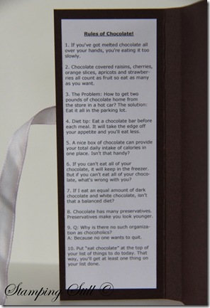
I saw this really cute chocolate holder on Lorri Heilings blog and I just had to make one.  She has all the instructions and a print out if you’d like to make one too.

On the inside are the Rules Of Chocolate and a chocolate bar. 

Amazingly there were no unopened chocolate bars in my house when I needed to take the photo.  I might have to buy quite a few in different sizes in order to get just the right fit.  The things we do for our craft  :)


IMG_2206


Of course I saw this months ago but by the time I got around to making one the Eat Chocolate set had retired :(  It’s a keeper though, there are so many great things to do with this set!


Ingredients :

Stamps :  Eat chocolate

Card :  choc chip, white, shimmery white, in colour dsp stack

Ink :  pip, regal rose, choc chip, versamark

Other :  white taffeta ribbon, clear embossing powder, mini glue dots, white pen, designer label punch, neutral brads, wide oval punch


Please take a look at all the great ideas the rest of the JAI team have come up with this week and give this sketch a try.


Kathy

Tuesday, August 9, 2011

Party Time

My daughter had a birthday party last week and these are the invitations I made for her BFF’s.
They are post-it note holders and I simply wrote the party information on the first page of them.  My daughter was convinced that turning 10, “double digits”, was a very important milestone, so I decided to make invitations that were a bit fancy and different.
For this one I used the island floral die to cut through about 1/4 of a post it note pad and then made front and back covers from her favourite stampin up colour – Rich Razzleberry.
IMG_2079

There was 1 boy invited to the party and I thought he might not appreciate the flower so I made this one for him instead.
IMG_2087

I also made these invitations fit the Splitcoast Creative Crew challenge for this month. 
CCREW0811DF, CreativeCrew, SUO or SUM – DSP/Color Focus: Pocketful of Posies designer papers (122354), or the following colors: baja breeze, daffodil delight, early espresso, night of navy, pear pizzazz, poppy parade, rich razzleberry, so saffron, soft suede, whisper white. Choose any 3 of these colors and make a friendship project—remember, sisters can also be friends!

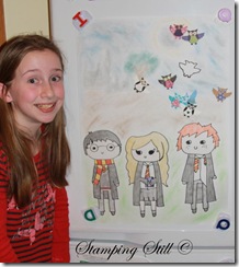
My daughter is very into Harry Potter and we played a few “Potterish” games.  Just thought I’d show you what we did with the owl punch at the party.  I gave the kids scraps of card and dsp and they made their own owls, like Hedwig but more colourful :)  Then we put magnets on the back of them.  I had my eldest daughter draw a cute Harry Potter Hedwig game  (same as pin the tail on the donkey).  She is great at drawing and I am not :)  We put it on the fridge and they had to get their magnet owls in the right spot.  Anyway it was a big hit and they all got to take their owl magnets home at the end of the party.  They all loved them!


IMG_2098crop


Kathy

Friday, August 5, 2011

Row 18


The challenge at Just Add Ink this week is to just add tearing, ripping or distressing.

I was asked by a friend if I could make a card for her son’s 18th birthday. She said that all she could find in the shops were cards with cars or beers on them.  He is not into that stuff and she wanted something personal.

She had 3 criteria:

1. She wanted an “18” on it.

2. She wanted the word “son” on it.

and the really tough one

3. She wanted it to be a rowing card.

I said “Yes” because I could totally relate, having seen the types of cards my son got at that age, but then freaked out a little.  What could I possibly make?  I did have to really think long and hard about this one.

I have no rowing stamps (I’m not sure whether any actually exist?) and none of the Stampin Up boat stamps either!

She told me that his club was the Buckingham Club (from Tasmania) and I googled it and found the club’s colours were pretty close to our garden green and summer sun (it’s a retired colour, lucky I had a little left!)  So I decided to make an oar in the water and used a stamp from Extreme Elements for the splash.


IMG_2072


Ingredients :

Stamps : extreme elements

Card : shimmery white, white, glossy white, black, summer sun, garden green

Ink : summer sun, white, versamark, Baja, NQN, Turquoise

Other : white ep., big shot, timeless type alpha


I used the computer to print the happy birthday because I didn’t have a set that said “son” in it.  I’ll have to rectify that soon :)

I stamped the splash in versamark and white embossed it and then I sponged baja, NQN and tempting turquoise onto shimmery white.

I was a little scared to tear the bottom edge because that was the last thing I did and I was very happy with what I had created.  But, I was so glad I did, it really added an extra dimension to the card and I love how it turned out.

Please have a look at all the gorgeously “ripped” and “torn” creations over at Just Add Ink this week and give it a try yourself.


Kathy

Monday, August 1, 2011

Friendly Language


This is a card I made for the new round of challenges at the Splitcoast Stampers Creative Crew.

This month the theme is Friendship and this card is for a colour challenge.

CCREW0811DF, CreativeCrew, SUO or SUM – DSP/Color Focus: Pocketful of Posies designer papers (122354), or the following colors: baja breeze, daffodil delight, early espresso, night of navy, pear pizzazz, poppy parade, rich razzleberry, so saffron, soft suede, whisper white. Choose any 3 of these colors and make a friendship project—remember, sisters can also be friends!


IMG_2073


This card uses a set called Language of Friendship which will be available in the new catalogue which is released September 1. 

Isn’t it pretty!  It uses the 2-step bird punch and the boho blossoms punch, so no cutting necessary :)


Ingredients :

Stamps :  Language of friendship

Card : baja, espresso, vanilla

Ink : espresso, baja

Other :  big shot, elegant lines, boho blossoms punch, bird punch, pearls


August is retirement month at Stampin Up.  It’s kind of sad because some of my favourite sets are retiring, (Pun Fun, sob!)  but it’s exciting too because we’ll have lots of lovely new sets to play with very soon!

If you’d like to take a look at the retirement list click here.  These things will never be available again and there are some good savings to be had too :)  Please email me if you’d like to place an order.


Kathy