Pages

Friday, May 27, 2011

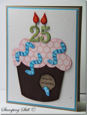
Worm wishes


This is my card for this weeks fussy cutting challenge at JAI


IMG_1616


There may be a couple of things about this card that seem a bit strange.

The first is that there are worms on top of a birthday cake and the second is that it’s a 25th birthday card that looks like it should be for a little kid.

Well it was my son’s birthday yesterday and he turned 25. Wow! Doesn’t that make you feel old!!!  But even though he’s getting old too (he’s just a big boy really), he doesn’t like your average “man’s card”, he likes fun and a bit crazy! 

So I had to get creative!

The worms?  Well this was just a bit of silliness.  I had that worm wishes stamp which fitted right in with my girls wanting to give him “gruesome” boys stuff.  You know, skulls, snakes, bugs, ghosts, that sort of thing.  He also loves shows like Bear Grills and Heston’s Feast where they eat weird stuff like bugs.  For Christmas last year he even got a lollypop with a grub in it.  All my girls thought it was gross!

Anyway hopefully you can see that there was some reason behind all of the madness.


Ingredients :

Stamps : Bugs and kisses, simple birthday thanks

Card : confetti white, crumb cake, turquoise, white, pear, poppy, peach, choc chip, hostess dsp pack

Ink : choc chip, turquoise and pacific markers

Other :  big shot, timeless type alpha, circle punch, linen thread, crystal effects


There was quite a lot of cutting out done on this card.  I used the Simple birthday thanks stamp for the cup cake and cut it out.  I also cut out the worms from bugs and kisses and I freehand cut the flames.  I did not cut the number candles though – that’s what I have a Big Shot for.

I hope you’ll check out the other cards at Just Add Ink and challenge yourself to do some fussy cutting too.

Kathy

Tuesday, May 24, 2011

Butterfly happiness

I thought I might show you a card the ladies in my club made the last time we met.
Quite simple on the outside…..
IMG_1602
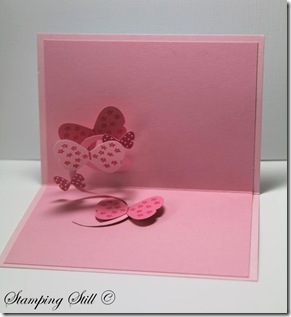
but there’s a surprise inside when you open it….

IMG_1605
It was a bit hard to get a good photo of the inside so you can’t really tell how cute it is. It’s called a spiral pop-up card.
Everyone really enjoyed making them.  They’re a bit different and very easy to make (and cute).  I got the instructions from splitcoast stampers. There is a tutorial here if you’d like to give it a try.
Ingredients :
Stamps : Heard from the heart. flight of the butterfly
Card : pip, pink pirouette, white, regal rose, brights dsp stack
Ink : melon mambo, turquoise
Other : butterfly punch, circle punch, mini glue dots, rhinestones, rhinestone brad, piercer

Kathy

Monday, May 23, 2011

Extra, Extra hostess promotion


I just had to let you know about a fantastic promotion Stampin Up are holding from May 23 till the end of June.

If you hold a workshop and achieve $450 in sales (INCLUDING shipping) then you’ll receive an EXTRA $70 to spend on anything from the catalogue.

As an example, say you get a few friends together, we make some cards, learn some things and have lots of fun and you get orders totalling $460.

That would mean you get to choose any level 1 stamp set from the hostess section of the catalogue and normally you would get $40 to spend from the catalogue as well – very nice!  BUT until the end of June you get the hostess set and $110 to spend from the catalogue! Wow!

Please email or phone me if you are interested in holding a party or placing an order.

k.tanner@live.com.au

I am in Hobart but if you are elsewhere in Tassie and are interested please email me,  I may be able to arrange something. :)

Kathy

thumb_extraextra_en-AU

Thursday, May 19, 2011

Monkeys for Alex


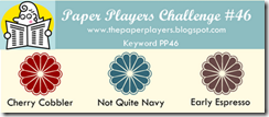
I needed to make a card for my nephew and I decided to use the colour challenge at Paper Players.  They extended the playing time because of problems with blogger last week and this gave me time to play along.  Yay!

image

Perfect colours for a male card.


IMG_1670


My sister told me Alex would love one of my monkey cards for his birthday. (Plus something to go with it of course!) I’m getting quite a reputation for using this stamp.  It’s actually my daughter’s set and it is the best birthday present I have ever given her. Ha Ha :)

I stamped the monkeys with espresso and then embossed them with clear.  It gave them more dimension and they’re nice and shiny too.  Can’t see that in the photo though.


Ingredients :

Stamps : fox and friends

Card : NQN, cherry cobbler, confetti white, whisper white

Ink : versamark, espresso

Other : big shot, polka dot embossing folder, clear embossing powder, square punches, thin espresso taffeta ribbon, timeless type alpha


There are lots of gorgeous examples using these colours on the Paper Players site.  Take a look and then give them a try.

Kathy

Tuesday, May 17, 2011

Baja Nature


This card is the last of my Creative Crew challenge entries for this month.

I was lucky that my new Nature Walk set fit perfectly with this colour challenge.  Neutrals with a touch of Baja (my favourite Stampin Up colour).

Next months challenges are a bit more challenging for me. I haven’t even started them yet, oops! Lets just say they’re not my favourite colour combinations and I may have trouble coming up with something that I like. We’ll have to wait and see but I will have some new Creative Crew cards to show you in June!


CCREW0511DF, CreativeCrew, SUO or SUM - DSP/Color Focus:
-- Go neutral with a splash of color! Instead of whisper white or very vanilla, try naturals white or ivory, confetti white or cream. Large emphasis on neutrals. Look to the Elegant Soiree DSP this month for inspiration: All neutrals with that splash of baja breeze! You do not have to use the Elegant Soiree DSP but that is the look that we're after.

I did use very vanilla on this card though.

IMG_1486


I brayered crumb cake onto the tulip embossing folder and ran it through the big shot with very vanilla card..  I liked the effect it gave the card.

I stamped the images with suede and just used an aquapainter to apply touches of Baja to them and sponged the squares with crumbcake.

The ribbon is vanilla taffeta which I tried to kind of pleat rather than gather up this time.


Ingredients :

Stamps : Nature walk, because I care, elements of style

Card : naturals ivory, vanilla, baja, crumbcake

Ink : suede, crumbcake, baja

Other : vanilla taffeta ribbon, pearls, hodgepodge hardware, square punch, big shot, framed tulips embossing folder, aquapainter, brayer, sticky strip


I was really happy with how this one turned out.  Can you tell I love my new Nature Walk set?

Kathy

Friday, May 13, 2011

Beecoming 18


As the current challenge at Just Add Ink is still going, I thought I would show you another of my Creative Crew challenge cards.

IMG_1520

CCREW0511DF, CreativeCrew, SUO or SUM - DSP/Color Focus:
-- Go neutral with a splash of color! Instead of whisper white or very vanilla, try naturals white or ivory, confetti white or cream. Large emphasis on neutrals. Look to the Elegant Soiree DSP this month for inspiration: All neutrals with that splash of baja breeze! You do not have to use the Elegant Soiree DSP but that is the look that we're after.


I used naturals ivory, baja and suede for the colour challenge.  The dot background was made by brayering baja ink onto the dot embossing folder and putting naturals ivory through the big shot.


Ingredients :

Stamps : Nature walk, so swirly, something sweet

Card : suede, naturals ivory

Ink : suede, crumb cake. baja

Other : big shot, polka dot folder, lots of tags, timeless type alpha, linen thread, neutrals brad


This is for my niece who is about to beecome 18 :)

Hope she likes it.

Kathy

Tuesday, May 10, 2011

Family Nature


Just thought I’d show you another challenge from the Splitcoast Stampers Creative Crew.

With this one you have to choose a layout and make a male and female card with it, while keeping the “antique” theme for this month.

CCREW0511HF, CreativeCrew, SUO or SUM - Holiday/Seasonal Focus -- Family Time! Mom's and Dad's days are here, but let's not forget about the Grandmas and Grandpas either. This month we're doing a his & hers challenge. Choose one layout and make a masculine card and a feminine card!

I decided to use Nature Walk and my grid technique to make a male card.  This one was for my Brother in law’s birthday.  I distressed this one quite a lot to try to make it more “manly”. I used the music notes wheel on the crumb cake and really scrunched it and then sponged crumb cake on it.

IMG_1119 

Ingredients : 

Stamps :  Nature walk, music notes, teeny tiny sentiments, sanded

Card : vanilla, naturals ivory, crumb cake, espresso

Ink :  crumb cake, espresso, river rock

Other :  linen thread, mini library clip, sponges, post its, big shot, lots of tags


Then this one is using the same layout but was for my Mum for Mother’s Day, so a “girly” version. For the challenge you didn’t need to use the same stamp set, but I love my new Nature Walk set so much I just had to!  


IMG_1133

Ingredients :

Stamps : Nature walk, very vintage, teeny tiny sentiments

Card : Espresso, vanilla, pink pirouette

Ink : pip, crumb cake, espresso

Other : linen thread, espresso thin taffeta, word window punch, modern label punch, pearls, pip button, big shot, square scallop die, sponges, post its


Kathy

Friday, May 6, 2011

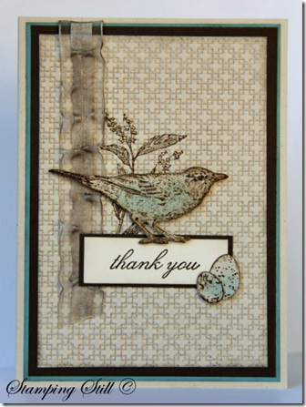
Thank you nature


At Just Add Ink this week we (it feels so good to be able to say that now) :) have a sketch challenge for you.

image

I decided to use the Nature Walk set from our new mini.

It is a gorgeous set and I will be showing you a lot more Nature Walk cards over the next few weeks.

image

I stamped the flower onto very vanilla, brayered crumb cake onto the square lattice embossing folder and then put it through the big shot.  I embossed everything else with soft suede and clear embossing powder and coloured the bird and eggs with baja.

The ribbon is white organza that I just coloured using a dauber and soft suede.  Then I just pulled a thread in it.  It coloured really easily and looks beautiful this new colour.


Ingredients :

Stamps :  Nature walk, Because I care

Card : vanilla, suede, baja

Ink : baja, suede, crumb cake, versamark

Other :  clear embossing powder, organza ribbon, dimensionals, big shot, square lattice embossing folder


Head over to Just Add Ink and see what the rest of the design team did with this sketch and then why not give it a try yourself.

Kathy

Sunday, May 1, 2011

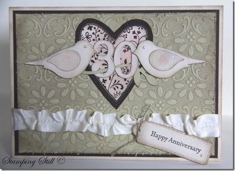
Pearl Wedding

This is the first card I made for the Splitcoast Stampers Creative Crew challenge.
The brief was to use Stampin Up products to give a card a distressed look.
IMG_1099

I had been asked to make a special 30th wedding anniversary card and I thought distressed would be nice but I didn’t want to go “too over-board” with it because I didn’t know the couple it was going to.  So I made it distressed and pretty at the same time!
I decided to use my Always heart, I haven’t used it for a while and I had forgotten how beautiful it is.  I realised too that it would team beautifully with the finial press embossing folder.  I brayered crumb cake ink onto the folder before putting the river rock in and running it through the big shot. Then I distressed this piece further with a sanding block. The heart is embossed with espresso on 2 layers and cut out.  I distressed all edges using crumb cake and sponged some pretty in pink onto the heart and birds.  I also added some champagne shimmer paint to their wings and tails.  I pulled a thread in the vanilla satin ribbon to give it a vintage look too.
Oh and there had to be pearls because your 30th anniversary is a pearl one if you didn’t already know. I didn’t, I had to look it up :)

Ingredients :
Stamps : Always, teeny tiny sentiments
Card : river rock, naturals ivory, espresso, very vanilla
Ink : espresso, crumb cake, pip
Other :  clear embossing powder, sanding block, daubers, champagne shimmer mist, pearls, bird punch, big shot, lots of tags, finial press, linen thread, brayer, vanilla satin ribbon, timeless type junior alpha

The person who ordered the card was very happy with it when she saw it and she told me later that the anniversary couple truly loved it, they said it was just so beautiful.  Yeah!!!  Love a happy ending!

SU-Creative-Crew
As for the Creative Crew challenges there are 4 each month.
I’m not showing you all my cards at once though :)
This one is for:
CCREW0511CF, CreativeCrew, SUO or SUM - Catalog Focus -- So Distressing. Use the Distressing Essentials kit, cutter kit, sponges, daubers. Make the new look old.
If you would like to join us and make a distressed card, just upload it to Splitcoaststampers and use the writing here in bold as your keywords.  It is probably easier if you just copy and paste these keywords from my blog.  Just get rid of either SUO or SUM.  The aim of the creative crew challenges is to get more stampin up cards into the gallery.  So cards are Stampin Up Only if possible, or Stampin Up Mostly (using 95% SU). Once you have posted this into the keyword section you upload to splitcoast as usual and you can add extra words to the keyword line such as what stamps you used too.
These challenges run for all of May and then 4 new challenges will be set.
If you have any questions just drop me an email.
I will let you know about one of the other challenges now too.  It’s a scrapbooking challenge and I’m not entering this one.  If a crew member decides to not enter one of the challenges then they enter 2 cards into one of the other challenges instead :)  So if you’re up for a scrapbooking challenge here it is :
CCREW0511SF, CreativeCrew, SUO or SUM - SB Inspiration Focus: -- Vintage Pages. We want to see black and white or Sepia photo's! We want the page to look like it's from a by-gone era, think antiquing, distressing, lace, etc.
Hope some of you can play along with us Crew members this month.
Kathy